October 2010 | Elysian Studios
Halloween: “Welcome Foolish Mortals”
Featured Artist: Katharine McGuinness
|
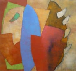
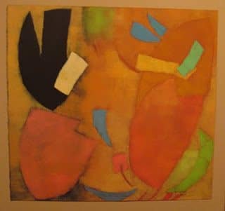
| “Tutti Frutti” monotype by Katharine McGuinness |
Discovering the work of Katharine McGuinness was a wonderful moment of kismet for me this year. When touring Denver’s Santa Fe Art District for their monthly First Friday Artwalk, I entered Spark Gallery and was immediately delighted by the saturated color and energetic shapes of these monotypes on paper, which were hung like mobiles throughout the gallery space. They twirled and danced as I walked around them, and I was captivated by their stunning compositions and rich texture. Katharine has an amazing eye for color and a mastery of abstraction. Often abstract works can lie flat and emotionless on their canvas or paper and get monotonous to view. These shapes seem to interact and move with each other, and the viewer has merely caught a snapshot of their action. Drawn in for a closer look, you begin to see the layers of color artfully built upon one another and gain an appreciation for the craftsmanship of these pieces.
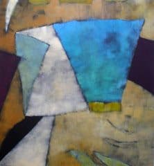 |
| “Birthday in Chinatown” monotype by Katharine McGuinness |
Shortly after I saw Katharine’s work at Spark, I wandered into her booth at the Cherry Creek Arts Festival, which is one of the largest, most prestigious annual arts festivals in the country and very difficult to be accepted into. This time I was able to meet Kate in person! She is a delightfully energetic woman, who happily shared information about her work and success with me, and I am still inspired by that conversation! Kate currently has a show at Zip37 Gallery, in Denver’s Navajo Street Art District, through October 31st. Her work is priced very reasonably ($800-$900, framed), and I highly recommend adding one to your art collection! I had the opportunity to talk with her about her work at the show’s opening, and laughed frequently at her analogies and wonderful stories.
Elysian: “I am not familiar with the monotype process, can you explain it to me?”
 |
| Katharine McGuinness at Zip37 Gallery |
McGuinness: “A monotype is a painting done with lithography inks onto a printing plate. I determine my composition, mix my inks and roll them onto the plate with a brayer. I control which inks go next to each other, and then transfer the colors in many layers with a press onto 100% rag paper. The paper is pure white to start, but there is none left when I am done! Some images may be similar, but each one is made completely by hand. There is no edition, and each piece is unique.”
Elysian: “What artists are the biggest influences on your work?”
McGuinness: “One of the biggest influences on my work is music. My process is similar to jazz. I used to play the guitar, so I relate to the rhythm and movement of music. As far as artists go, I hate to look too much at others, because I want my work to be it’s own, and artists can’t help but steal ideas from one another. I do love Rothko and Villard.”
 |
| Katharine McGuinness at Zip37 Gallery |
Elysian: “I also see a lot of Kandinsky (one of my favorite artists whose imagery was strongly influenced by music)”
McGuinness: “Yes, in fact I named one of my pieces after him!”
Elysian: “How do you know when a piece is finished?”
McGuinness: “It is so important that a piece doesn’t look overworked! Its like a delicate pizza dough that you skillfully toss in the air and as soon as it’s right you stop!”
 |
| “Swimming Up Stream” monotype by Katharine McGuinness |
Elysian: “Which piece in the show is your favorite?”
McGuinness: (pointing) “Swimming Up Stream”
Elysian: “That is my favorite! I love the black!”
Kate and I had a great time discussing her work, and her show is beautiful! I look forward to seeing her next show, especially how she chooses to display her pieces. She always gives thoughtful consideration to the viewer’s ability to interact with her work and see it as clearly as possible. You can view more of her work on her website at http://www.mcguinnessstudio.com/ , and be sure to stop by her show at:
Zip37 Gallery
3644 Navajo Street (Highlands)
through October 31st
Art Tour: King Tut at the Denver Art Museum-part 2
In my previous post, I covered the basics of preparing to visit the King Tut exhibit at the DAM, but if you can’t get to the museum, I’d like to share some of my favorite pieces in the collection. All of the pictures in this post are from the book “Tutankhamun: The Golden King and the Great Pharoahs” by Zahi Hawass. This is the Official Souvenir Guide to the Exhibition. Dr. Hawass is an impressive archaeologist, and I’m amazed at how much he continues to discover and share about Ancient Egyptian culture. If you listen to him speak about his discoveries, or watch him on a National Geographic DVD, his joy and excitement shines through and is contagious!
There are three major focuses of the artifacts in the King Tut exhibit: The Pharoahs, The Treasures, and The Household.
The Pharaohs:
“The word ‘pharaoh’ comes from a Hebrew word in the Old Testament referring to the ruler of Egypt, derived from an ancient phrase, per aa, meaning ‘great house.’ ” says Hawass.
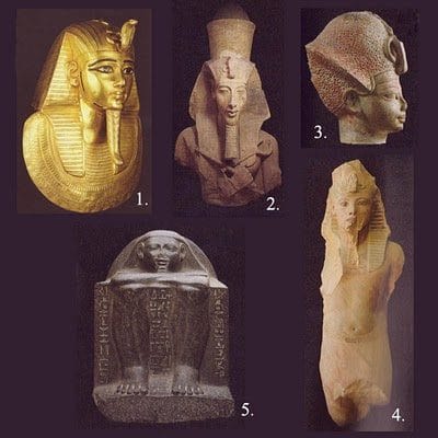
1. “Funerary Mask of Psusennnes” ,gold inlaid with lapis lazuli and black and white glass. Solid gold masks like this were used to cover the face, head and chest of the Pharaoh mummies. The cobra and false beard point to the royal and godly status of Pharaoh, and gold was believed to be connected with the light of the sun, one of the major gods in Egyptian religion.
2. “Sculpture of Amenhotep IV” , sandstone. Akhenaten, also known as Amenhotep IV, was King Tutankhamun’s father, who controversially changed Egypt’s worship from the sun god “Amun” to the sun god “Aten.” In fact, King Tut’s name at birth was Tutankhaten, and changed to Tutankhamun after he inherited the throne and restored worship to Amun. This lage and impressive sculpture of Amenhotep IV once “stood against large square pillars in the colonnade of the King’s temple to the god Aten at East Karnak,” says Hawass.
3. “Amenhotep III” , plastered and painted unbaked clay. There are different significances to the crowns portrayed by the Pharaohs. This portrays the “blue crown”, or “war crown.” The statue of Amenhotep IV (#2) portrays the “double crown” which symbolizes Pharaoh’s rule over both Upper and Lower Egypt, and the Funerary Mask (#1) displays the “Nemes Headdress” which is the most common crown we associate with Pharaoh, and symbolizes his divinity.
4. “Colossal Statue of King Tutankhamun”, quartzite. This is a gorgeous statue, and it’s worth the trip to the DAM just to see it. It is one of a pair of statues found in the funerary temple of Ay and Horemheb, two very influential Egyptian leaders at the time of Tut’s reign. The smooth belly, contrasted with the striated skirt and intricately painted details of his face are something to behold. This is why we are still fascinated with Ancient Egypt!
5. “Statue of Hetep”, stone. Another example of fascinating and influential Egyptian Art is this abstract block sculpture of Hetep, who probably served in the court of Amenhotep I. It depicts a seated figure and focuses on the carved hieroglyphic inscriptions, rather than characteristic details of the figure itself.
Art Tour: King Tut at the Denver Art Museum-part I
Featured Artist: Tim Baron Illustration
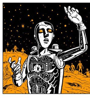 |
| “Sci-Fi Theologica” by Tim Baron |
Tim Baron is an extraordinarily talented artist and illustrator whose work I have admired for years. He has an entertaining variety of subject matter to which he delivers a unique style! Tim consistently produces subject matter that has a passionate heart, whether it is about the Gospel, children’s books, the current dangers facing teens, or a painting of a monster statue his daughter gave him! He is a a self-described, comic-book and action figure addict (to which I can totally relate), graphic designer-by-day, and family man.
One of my favorite works by Tim is this beautiful drawing of Jesus saying “Let the Children Come to Me”. Tim has an amazing ability to put a lot of emotion into simple gestures, which makes his characters graphically stunning. (I also secretly admire his ability to turn sounds into cool words like “KZAAK!” “BOFF!” and “MUAHAHAHA!”) I recently caught up with Tim to gain more insight into his process, and find out about his newest projects.
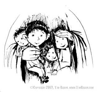 |
| “Jesus said ‘Let the children come to Me’ ” by Tim Baron |
Elysian: “When did you make your first comic book and what was it?”
Baron: “Hmmmmmm….I believe I made my first comic in early grade school. My best friend Curt and I were obsessed with Transformers. We made up these Transformers stories that we would write and draw comics for. Each of us would work on it for a while and then trade off. I still have some of them.
As far as comics go, I’ve been obsessed with them since before I can remember. I was first introduced to super-heroes on shows like “The Electric Company” and “The Bozo Show.” I do have a very early memory of going to the grocery store with my Mom and buying what I believe was my first comic book. It was an issue of Green Lantern where he fights Star Sapphire. I would always stand and look at the comic rack when I went to the grocery store with my mom. I loved pouring over those books, and a lot of those same covers still stick in my mind.”
New Painting and YouTube Demo
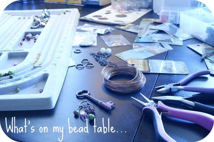
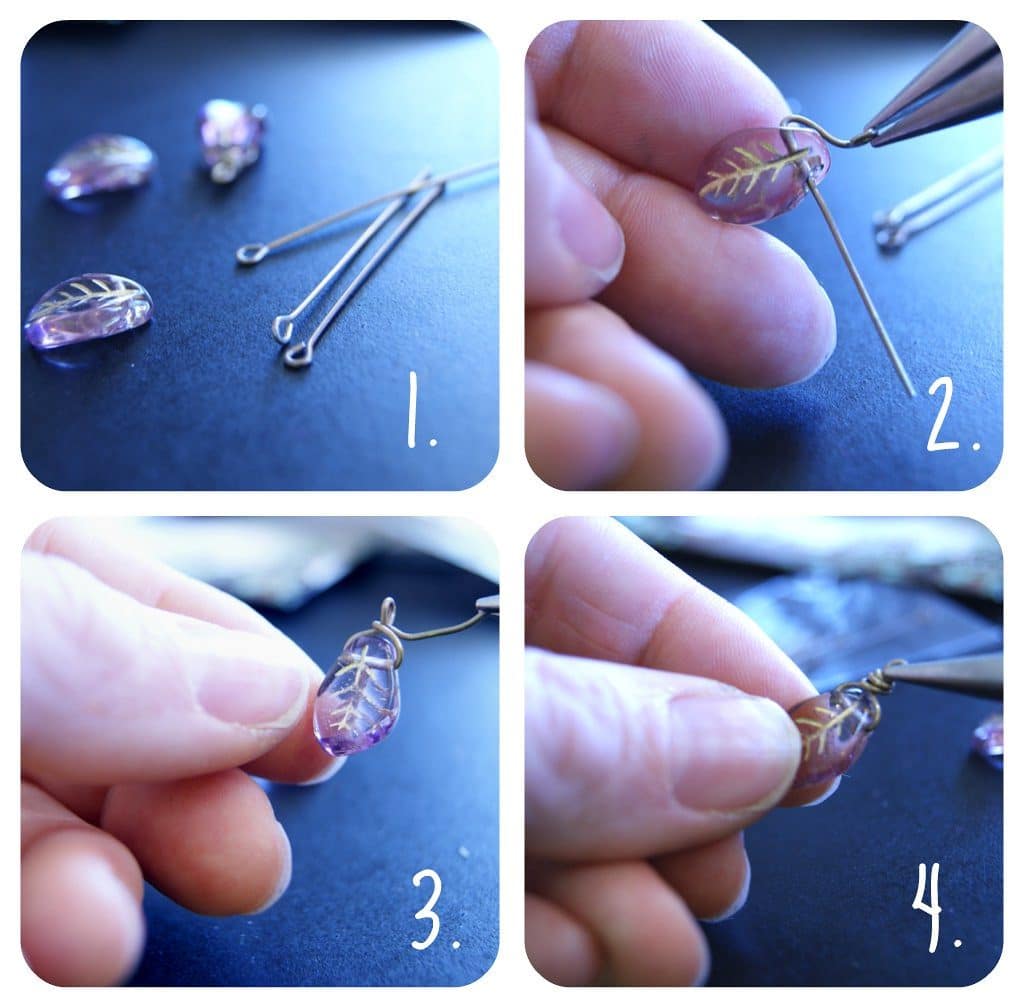
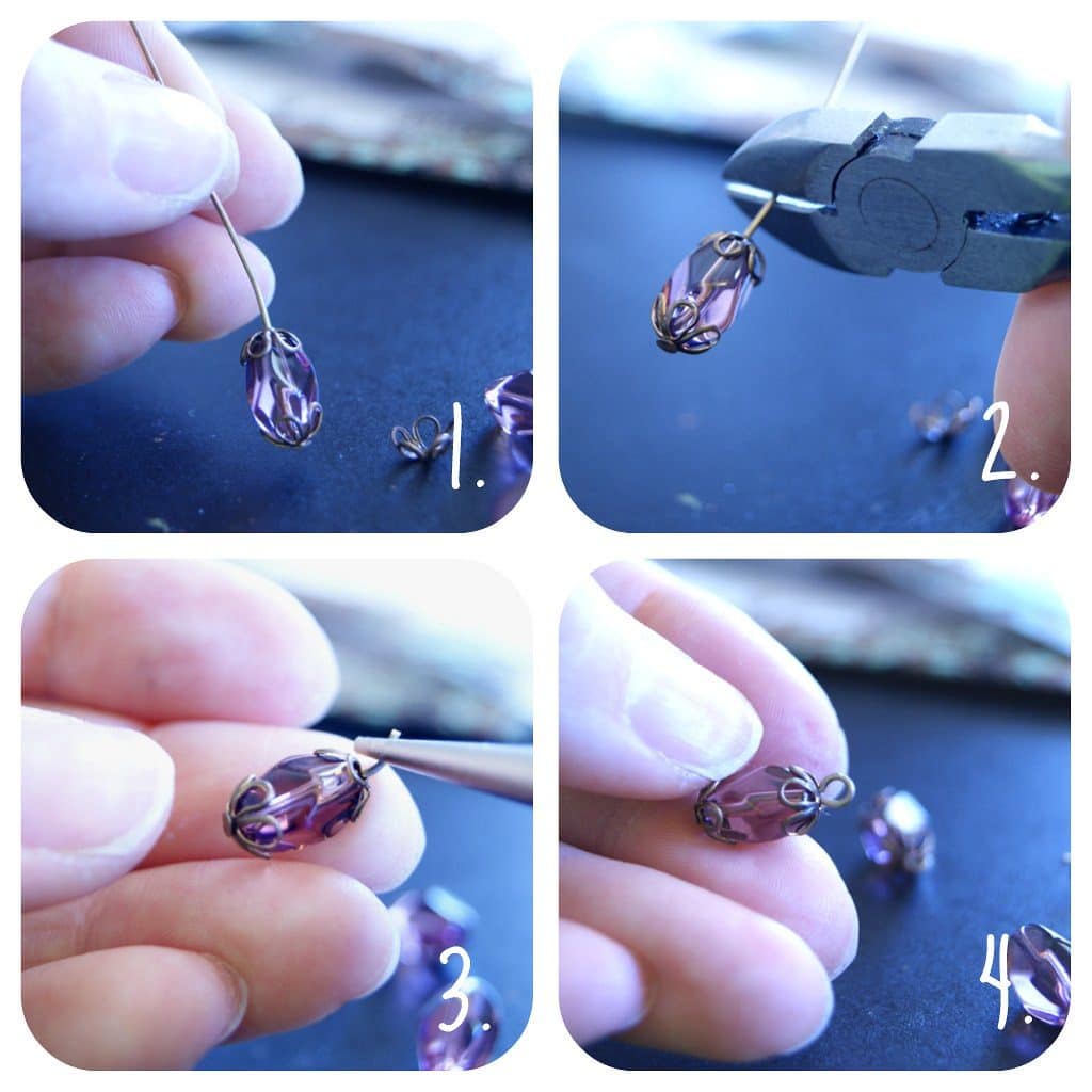
Artists at Play: Lorelei’s Michael’s Bead Challenge
Featured Artist: Angus Wilson
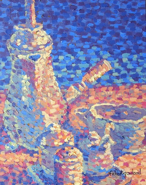
The Artful Life: Painting a Recipe: Peaches
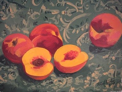 |
| “The Lonely Peach” oil on canvas, mounted on board by Erin Fickert-Rowland |
Colorado’s Palisade Peaches are famous for their firm, juicy, delectable smelling flesh, and I am mourning the end of their season! At $0.98 a pound, I kept buying bags full, intending to freeze some, but they were just too irresistible! We did manage to save enough to make this delicious cobbler though!
Pecan-Peach Cobbler from Southern Living Magazine,
June 2010 Click here for printable recipe
*note, I only used 2 pie crusts and just sprinkled sugar and pecans on top of each layer. This was easier and much less fattening! Be sure to watch for browning on the nuts, and brush a little milk on the very top to prevent burning. I also did not cut apart the crust to make it look fancy…I don’t have that kind of time!
Ingredients:
12-15 fresh peaches, peeled and sliced
1/3 cup all-purpose flour
1/2 teaspoon ground nutmeg
3 cups sugar
2/3 cup butter
1 1/2 teaspoon vanilla extract
2 (15 oz.) packages refrigerated piecrusts
1/2 cup chopped pecans, toasted
5 tablespoons sugar, divided
Sweetened whip cream (or vanilla ice cream) to serve
The Artful Life: Painting a Recipe: Green Chiles
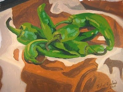 |
| “Longhorn Chiles” oil on canvas, mounted on board by Erin Fickert-Rowland |
Growing up in New Mexico as a child, I have many memories of roasting and drying large quantities of green chiles. I still adore them in just about everything, including my own recipe for Green and White Chicken Chili! Serve with cheese quesadillas and enjoy!
Click here for Printable Recipe
Green and White Chicken Chili
Ingredients:
1 teaspoon olive oil
1 onion, chopped
4 boneless, skinless chicken breasts, cubed
4 cloves garlic, minced
2 fresh mild green chiles, seeded and chopped
1 packet McCormick’s White Chicken Chili seasoning
1 can diced tomatoes with Mexican seasoning
2 cans chicken broth
2 cans great northern beans, drained
1. Heat large pot or dutch-oven over medium heat. Add olive oil and onion, and cook until translucent.
2.Add chicken and cook until done. Remove chicken and onion mixture from pot, and set aside.
3. Add garlic and green chiles to pot (add a little more oil if needed). Cook 1-2 minutes.
4. Return chicken mixture to pot. Add chili seasoning packet. Cook 1 min.
5. Add all remaining ingredients. Bring to a boil. Reduce heat and simmer, covered, 1-2 hours.
6. Season with salt and pepper as desired, and top with dollops of sour cream. Serve with cheese quesadillas on the side!
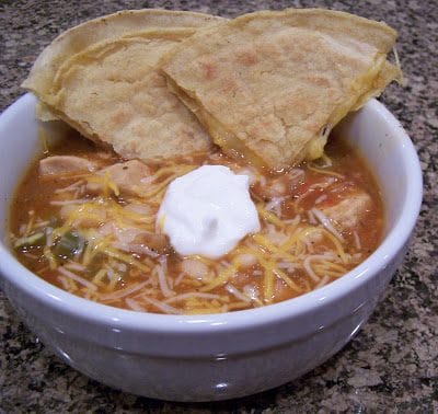 |
| Green and White Chicken Chili |
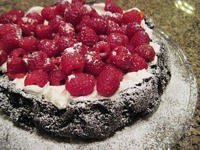
The Artful Life: Painting a Recipe: Raspberries
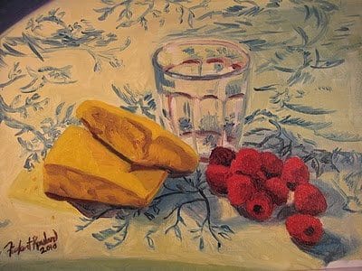 |
| “Breakfast with Raspberries” oil on canvas, mounted on board by Erin Fickert-Rowland
I am starting a new series of fruit and vegetable still lifes, and I love to cook, so I want to share both my painting and a delicious recipe for you to enjoy at home! Click here for printable recipe Berry-Berry Brownie Torte from “Best-Loved Hershey’s” *note:original recipe calls for 3/4 cup raspberries and 3/4 cup blackberries, but I used all raspberries, I also substituted Lite Cool Whip for the heavy whipping cream! Ingredients: 1/2 cup all-purpose flour 1/4 teaspoon baking soda 1/4 teaspoon salt 1 cup Hershey’s Semi-Sweet Chocolate chips 1/2 cup (1 stick) butter or margarine 1 1/4 cups sugar,divided 2 eggs 1 teaspoon vanilla extract 1/3 cup Hershey’s Special Dark Cocoa 1/2 cup whipping cream 1 1/2 cup fresh raspberries, rinsed and patted dry |
1. Heat oven to 350 F. Line 9-inch round baking pan with wax paper, then grease. Stir together flour, baking soda and salt. Stir in chocolate chips.
2. Melt butter in medium saucepan over low heat. Remove from heat. Stir in 1 cup sugar, eggs and vanilla. Add cocoa, blending well. Stir in flour mixture. Spread mixture in prepared pan.
3. Bake 20-25 minutes or until wooden pick inserted in center comes out slightly sticky. Cool in pan on wire rack 15 minutes. Invert onto wire rack; remove wax paper. Turn right side up;cool completely.
4. Beat whipping cream and remaining 1/4 cup sugar until sugar is dissolved and stiff peaks form. Spread over top of brownie. Top with berries. Refrigerate until serving time.
Makes 8-10 servings
 |
| Berry-Berry Brownie Torte |


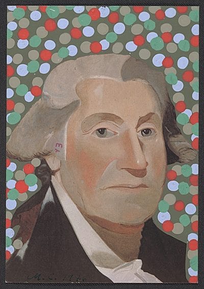 .
.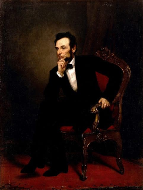 America’s 16th President, Abraham Lincoln is still beloved by our nation for leading our country through one of it’s most divisive periods in history. “In temper he was earnest, yet controlled, frank, yet sufficiently guarded, patient, yet energetic, forgiving, yet just to himself; generous yet firm,” wrote J. T. Duryea of the U.S. Christian Commission, which met frequently with President Abraham Lincoln. “His conscience was the strongest element of his nature. His affections were tender and warm. His whole nature was simple and sincere – he was pure, and then was himself.”
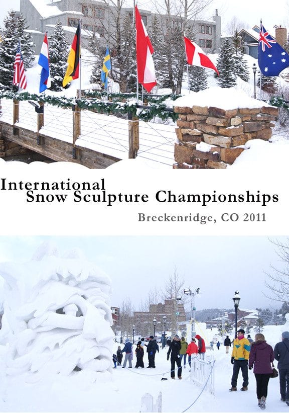
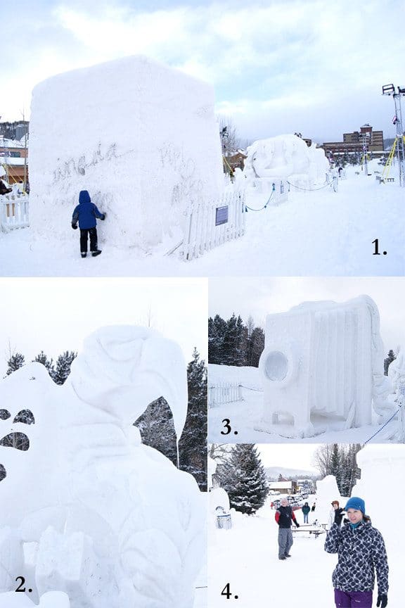
 I love the abstract, so I was immediately drawn to Sweden’s entry, “Perpetual Motion,” which reminded me of Henry Moore’s “Locking Piece” sculpture (image 1). Team Yukon received second place for their haunting sculpture, “Spirits of the Aurora,” which portrays the Northern Lights as torches held by spirits seeking the souls of those who just died (image 2). “Mere De Nation” was Team Canada’s entry, which paid homage to the adventuresome young brides who crossed the Atlantic in the 1600’s to marry the settlers of the Saint Lawrence River Valley. The sculptures were illuminated at night and you can visit the website to see more beautiful photos of the winning snow sculptures. It was impressive to see these large pieces. My husband and I always joke about needing a “scale figure” in a photo- so here I am! (image 4)

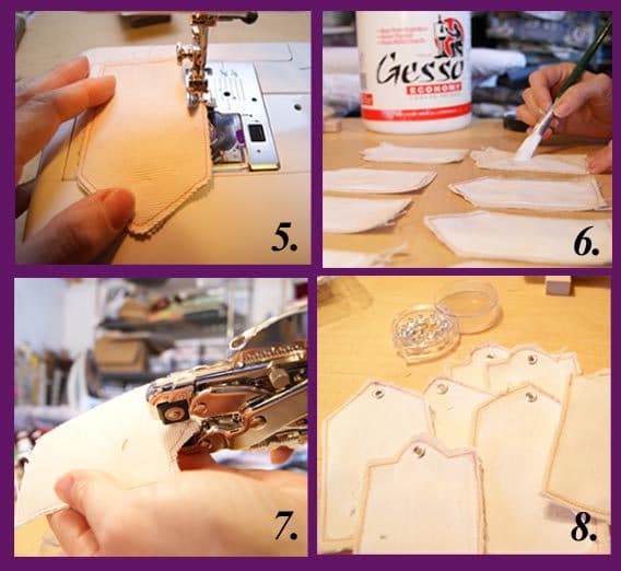
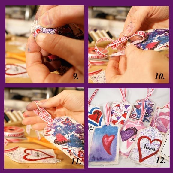
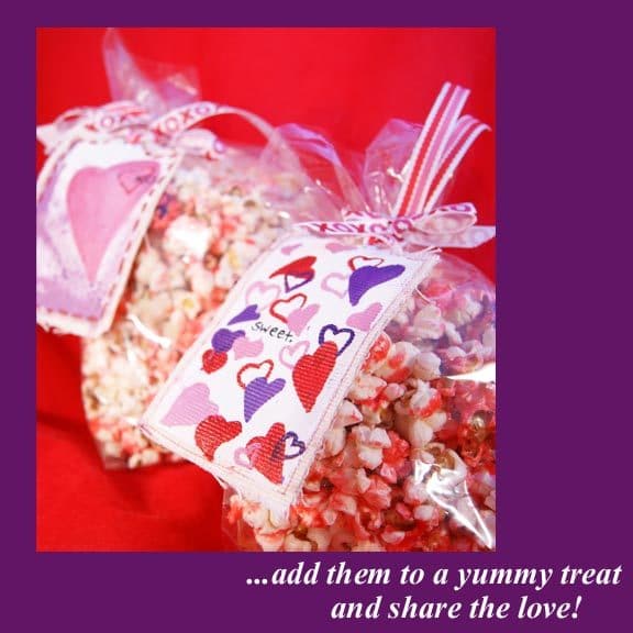
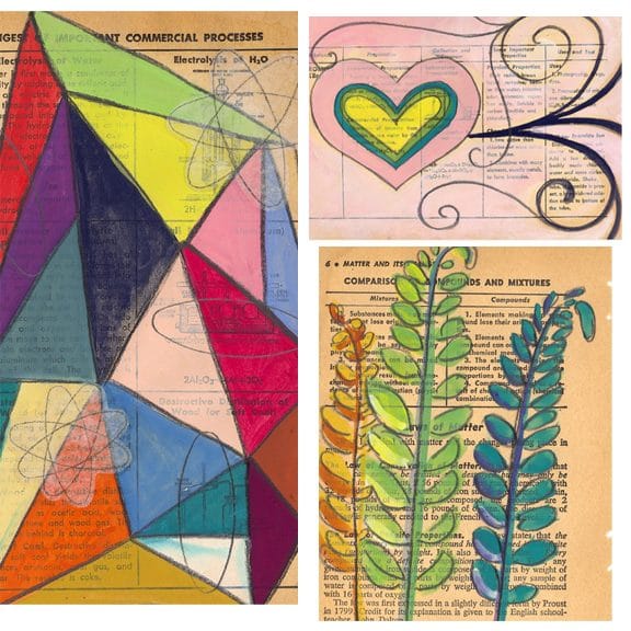
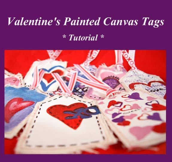 Here’s a simple craft, that has lots of different applications, especially if you are a painter! If you’re not a painter, just break out some colors and have fun with it! These are unique gift tags, but would also be fun on cards and in scrapbooks. For you crafty entrepreneurs, these would make a special addition to your packaging! Like ACEO’s? This technique can be used to create some new editions! Most importantly, they are a great excuse to get whimsical and doodle with paint!
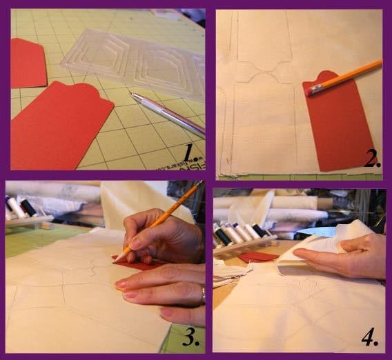
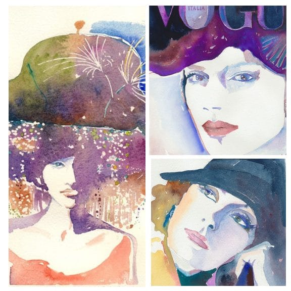 left: “John Galiano Hat” $45, top right: “Italian Vogue” $55,
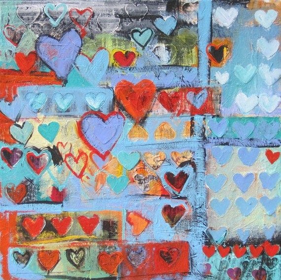 “Layered Hearts” $95
 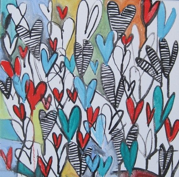 “Pop Hearts” $85
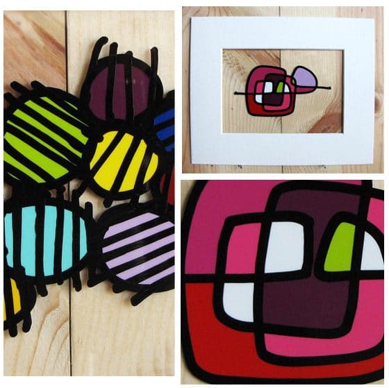 left: “Circles 022″(detail) $50, top right: “One Liner 010” $50,