logo-black

Visual Identity for International iGaming Brand

“BETO.com is seeking your services in creating a new look and feel for their Gaming Brand.” This was what one of our client’s emails read from last September when they came across my website after reading about my work for the Broncos.

It turned out that this project wasn’t much different from others I’ve done before, except that the brief itself was way more complicated. I did not know how online gaming worked or my experience designing graphics for video game brands. Still, I accepted it as part of my search for creative challenges.

The company wanted me to create three sets of concepts with multiple designs per set — all within 30 days! They also provided detailed information on their existing branding to get started immediately. This meant I needed to be creative while keeping things simple to meet deadlines.

Read on to get the entire story about this unusual project completed by me 🙂

The story of an unusual design case for a gaming brand

You must start thinking about everything that may arise when given such an odd task. For instance, the brand name has several meanings (BETO), making us wonder if we should use them interchangeably throughout the campaign. Shouldn’t the colors reflect those names somehow? What kind of imagery would work best for each concept? And how can we make sure these ideas stay true to the original vision? All questions are worth considering, especially since only two weeks are left until the deadline.

If anything goes wrong during final revisions, there will likely be problems communicating back to the client. To avoid confusion, having clear guidelines from the beginning helps immensely.beto-com-logo-tm-gmb-4-3

How I Designed a Logo for an international brand

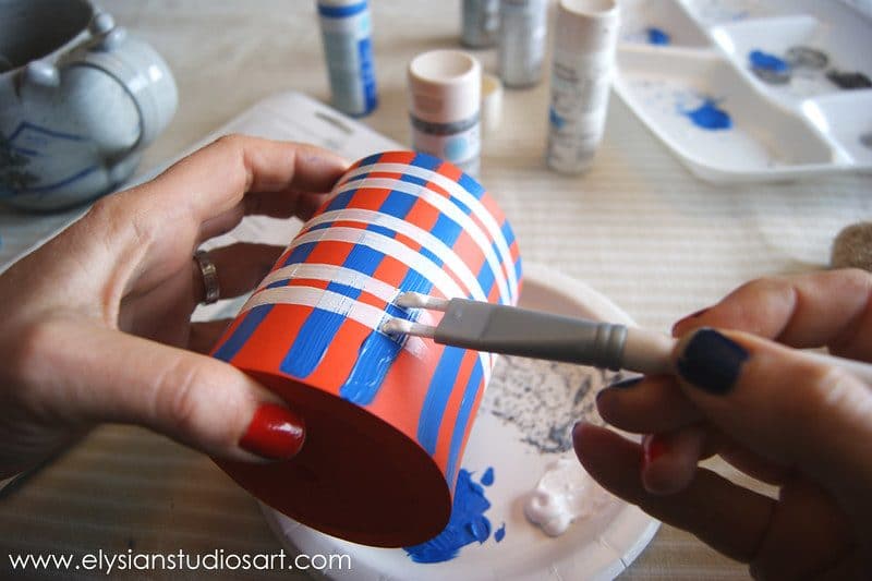
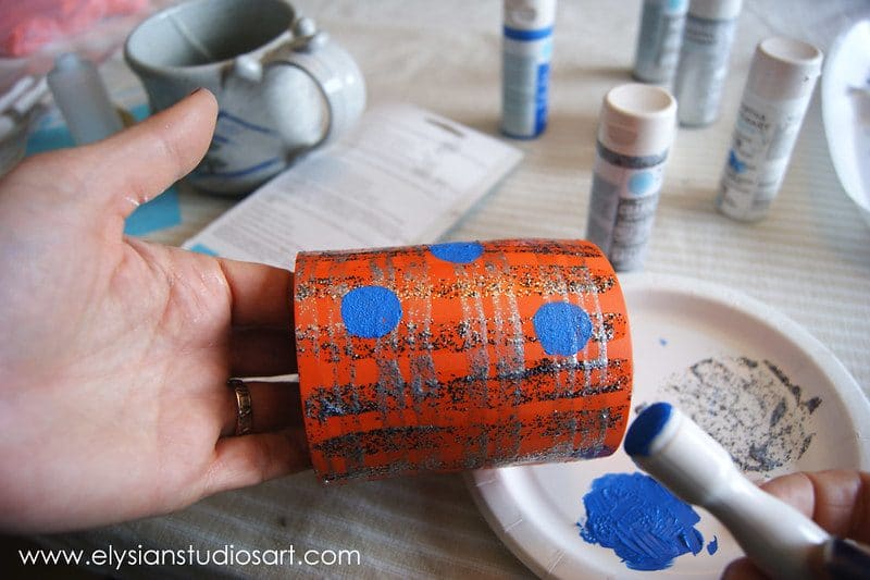
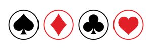
Once I got past the first hurdle, I knew the next challenge wouldn’t be easy. My client wanted 3 separate concepts based on their current logo. But instead of just using the same color palette, the final concepts followed entirely different themes. We decided to use red, white, and grey as base colors. These colors have been used prominently over the years at slot machine manufacturers, including International Game Technology (IGT), Bally Technologies, and Scientific Games Corporation. And these colors are also often used on casino chips (the play money used at land-based casinos)

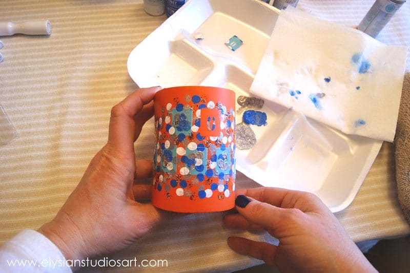
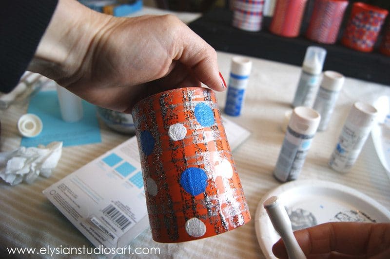
One of the early versions included a twisted chip representing the three primary colors. We discussed various ways these colors might relate to BETO’s long history of letting regular players experience online slots without spending real money (these are so-called demo-slot machines). However, the team felt this didn’t fit well into today’s market, where players want something more modern. A skewed chip seemed outdated compared to the rest of the industry. So we opted for a series of circles around a central point instead of as this was a closer match to a casino chip.

After getting feedback from my client, I sketched out a few options. Since they liked the idea of taking elements from the old logo, I thought showing its evolution would be interesting. To do this, I placed a white circle inside every colored circle. In the middle, I added small card-based symbols represented as the core. By doing this, I could show the progression without cluttering the image. From here, I sent over five variations of each concept and asked for comments/feedback. After receiving positive responses, I chose the most potent version and developed it further.

inspiration for the logo

I made notes of thoughts, sketches, etc., onto sticky notes to keep track of time. Then once I had finalized the concepts, I organized them into folders on Google Drive. Using a tool called Canva allowed me to design full-colour layouts very quickly. With the help of Photoshop Elements 12, I cut out shapes and letters from photos and illustrations already found on Pinterest. Once I finished cutting out images, I uploaded them into Adobe Illustrator, where I adjusted and modified them according to client specifications.

In addition to sharing assets easily, I love that this program allows you to change font sizes on individual objects. Doing this helped tremendously in making text easier to read on mobile devices. If you don’t know how to do that yet, check out our guide to optimizing web pages for mobile screens.

The initial idea of the spinning casino chip

casino chip was inspiration
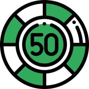
From the moment I saw the actual physical chips, I knew I couldn’t stop thinking about them. Their shape reminded me of coins. There’s a hole in the center surrounded by raised ridges. As soon as I put together a rough sketch of what I envisioned, I knew it was perfect.

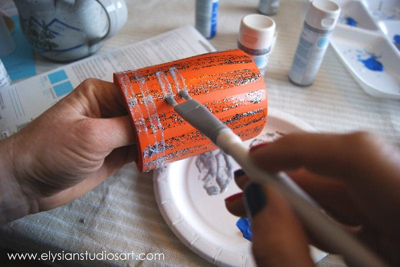
But there was still one thing missing…the background texture. When looking at real casino chips, you’ll notice that none have a solid surface behind them. Instead, they usually feature a patterned backing material.

So, I searched through reference files for textures similar to what I was trying to achieve. Luckily, I still found something suitable. It featured playing card symbols. After tweaking colors, adding shadows, and adjusting contrast, I settled on a final design.

Many tutorials show how to recreate the effect yourself for anyone who wants to add custom backgrounds to their creations. You can find the links under the Resources section.


How I Created the brand identity

Now that we’d nailed down all aspects of the visuals, I began working on the words. While it’s important to remember that many people associate certain colors with specific emotions, the overall message must speak for itself. The goal was to communicate the essence of the brand without going overboard.

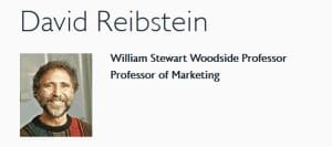
One primary concern for me was whether or not to include the word “gaming” in the tagline. Many designers believe consumers won’t trust a business unless it includes this term. Marketing professor Dr. David Reibstein states that “there is little evidence explicitly linking product categories to emotion leads to greater sales.” On the contrary, research suggests otherwise.

elysin

As someone who loves playing internet games, I understand why many people think it sounds weird. However, I wanted to convey my passion for them, so I kept the wording clean and subtle. So instead of incorporating a long tagline, we settle with the core word: BETO as the brand’s essence, like BET-ONLINE or BET-ON, conveying positive and forward motion and momentum.

Another decision was directly incorporating the customer service number into the graphical outline. That said, not everyone has access to smartphones. Or maybe they prefer to call companies rather than send emails. Whatever works best for your audience, try incorporating it somewhere in the copy.

Finally, I gave myself a strict timeline. I knew I had less than two weeks to deliver this project. I needed to deliver high-quality artwork fast, even without sacrificing any creativity. Thankfully, I discovered an excellent resource for learning Adobe Illustrator shortcuts.

By utilizing these techniques, I managed to finish the project on schedule. And the outcome was exactly what we had hoped for. 

I learned a lot about the process. I plan on doing more work for BETO™ if they allow me to.

Creating a memorable brand requires careful planning, consideration of details, and plenty of trial & error. Don’t forget to ask many questions and take copious screenshots throughout the process. Also, consider asking for references from previous jobs. Most importantly, never give up hope. Good luck!

12259612244_787b52ca41_c-7773772

Elysian Studios

12259612244_787b52ca41_c-7773772

We’re getting ready to celebrate the big game, and cheer our Denver Broncos on to a Super Bowl XLVIII victory!  What better way to add to the festivities than with handmade can coolers for the party?

For this easy tutorial, I have used all Martha Stewart craft paints and tools, which are readily available at Michael’s Arts and Crafts Stores.  These were provided to me by Plaid paints for a campaign I worked on in 2012.  You can see that post here.  All of the opinions expressed about the products are completely my own.  I made three different styles of coolers, two in each style. The foam coolers are available at any craft store. I made each cooler unique by switching up the colors a bit, so each party guest can easily identify their beverage.

Let’s get craftin’!

12259174105_4321216ab1_c-8960169

For the first style, which you can see in the front center of the title photograph, I used Martha Stewart’s Adhesive Stencils, the Foam Dauber Set, Satin Craft Paint in blue, white and two colors of the Coarse Glitter Paint. I found lots of inspiration for patterns on Pinterest.  You can follow my Pinterest boards here.

12259760706_6af555a5df_c-5529610

Place the letters on the cooler to spell out your saying.  I really like these stencils because they give your project unique, uniform lettering and can be reused.  I was short on the “O” for my saying, so I was able to easy move that letter around during painting.

12259760146_c89bbb010f_c-7300108

Pour the paint colors onto a disposable plate and use the small size dot of the dauber set to begin painting dots all around the stencils.

12259337203_d42845bf60_c-7941613

Once you have dotted all of the colors around, peel off the stencils.  Rinse them in water to clean and place back on their plastic film from the package.  I thought I wanted the letters to be multi-colored, but you really couldn’t read them, so I ended up re-painting the letters in solid blue.  Don’t let the paint get too dry before you lift off the stencil or the paint will come off with the stencil.

12259613274_f04c0e86e8_c-4806362

For the second style, I used the same paints, but tried out the Martha Stewart Patterned Brush Set.  These coolers are on the left side of the title photo.

12259761066_c1ac391291_c-8113912

I have mixed feelings about this brush set, and I’d love to hear from other crafters who may have used it.  It looks fun and full of promise, but I found the results to be underwhelming.  Using the brushes saves a bit of time because you get two or three lines per stroke.  However, I found them hard to load paint onto the bristles, and they really didn’t give any more consistent lines or spacing than a single brush.  In the end, I do like the bold, simple plaid pattern of this cooler.

12259175595_06794a90e0_c-6126942

Using the largest two-stripe brush, first paint vertical stripes of blue and allow to dry.  I really like the Martha Stewart Satin Craft Paints, because they come in a beautiful array of colors, give nice even coverage, and dry pretty quickly.  Since I had to quickly paint over my first layer for this pattern, however, I used a hair dryer to speed along the drying process!

12259338253_35585cccdc_c-1686170

Next use the smaller two-stripe brush to paint horizontal stripes in white all around the cooler.  I also used the same method to paint a second cooler, but used the two glitter paints instead.

12259760476_3eaf0fbec3_c-4392602

Though I really love the sparkle of glitter, I had uneven results with the Martha Stewart Coarse Glitter Paint.  The glitter is actually suspended in a clear binder, which is great because that prevents it from easily flaking off.  However, the paint doesn’t apply easily and smoothly, as you can see in the image above.  The paint kind of smooshes to the sides and the glitter is unevenly distributed.  I found that with multiple coats I was able to achieve the results I was after.

12259337783_5098840118_c-4775674

For fun, I decided to add some blue dots with the largest dot size in the dauber set.

12259613794_7eaf3c46a3_c-9313277

To finish this cooler, I added white dots in the medium size dauber from the set. I really love how easily I can get consistent dots in different sizes with this set!

12259759296_6f16187c3b_c-3795428

For the last style, I simply used the Satin Craft Paint and the Fine Tip Writer Nozzle Set.  This set lets you simply twist on a fine tipped nozzle to any of the Martha Stewart Craft Paints.  The paint bottle on the left is a Metallic Glass Paint, which already comes with a fine-tipped nozzle.

12259176155_bcbb6e04f5_c-8282609

I love how these tips allow you to quickly and easily create fine lines with any of the craft paints.  This finished cooler can be seen on the right side of the title photograph.  For this pattern, make three vertical lines in blue, about 1/2 inch apart, and then one vertical line in white, about 1/2 inch from the last blue line.  Continue with this pattern around the cooler.

12259614914_0c661dffc3_c-8627201

After you have completed the initial lines of the pattern, draw multiple diagonal lines within the borders of the vertical lines.  Alternate their directions so they form a chevron pattern.  Alternate two rows of blue lines and two rows of white lines.

12259338453_92a7fc4abe_c-2624434

Here’s another look at the completed set:

12259612244_787b52ca41_c-7773772

I am posting this shortly before the big game, but it really is a great craft to show team spirit for any sports team during any season!

We’re filling up our coolers with sodas and Colorado microbrew beers, like these from Tommyknocker Brewery in nearby Idaho Springs for our Super Bowl party, and we’ll use them for many more seasons to come!

GO BRONCOS!

fulleslbannerlogo-1000pxwidecopy-8980360

Introducing a new Elysian Studios | Elysian Studios

Saying “Goodbye” to the old

and “Hello” to the new…

I believe an art business should be a living, breathing endeavor that continually displays new growth.


Just as a tree reaches taller to the sky, with roots extending deeper into the ground so it may produce more luscious fruit, an art studio should show evidence of similar transformation and maturity.

Elysian Studios is growing through this type of change.  Having launched this business in 2009, I’ve guided it through its infant stages, offering many different products and types of content to see what would provide the greatest value to my customers and to discover what I am most passionate about.  As always, I am ever grateful to the people who have supported my efforts to pursue a career in the arts.  Whether it’s been leaving a comment, buying beads, handmade jewelry, small note cards or a painting, I simply could not be here without you.  I am incredibly excited to present to you the new changes I’ve been busy working on!

Introducing the new Elysian Studios logo:


fulleslbannerlogo-1000pxwidecopy-8980360-4728243-6848204-5924264

I have moved my website to a new provider, who has already demonstrated better service and more customized options for Elysian Studios.  I am focusing the products offered by my studio to provide the best original art and service to my clients, so I’m saying goodbye to some of the products I have offered since Elysian Studios’ inception, most notably my handmade art jewelry.  Though I thoroughly enjoy designing and creating jewelry, it requires a great deal of resources that distract me from my true passion…oil painting.

To document another milestone in Elysian Studios’ journey, here’s a screenshot of my previous website for posterity:

indiemadelandingpage-4413225-8272039-1927547
Old www.ElysianStudiosArt.com website ©2013

newesweblook2014-7028193-4898643-6359412-2660285
New www.ElysianStudiosArt.com website ©2014

For the time being, I will still have original paintings and art jewelry in the Elysian Studios Etsy Shop. Going forward, I will continue to offer prints and note cards in my Fine Art America Shop, and I am starting to collaborate with other companies to offer my art on custom products that are just perfect for unique gifts.  I am also excited to share that Elysian Studios will now be offering custom matting and framing services.  If you are buying a new piece of art or you have a treasured piece already in your collection, getting it displayed beautifully on the wall is very important!  My unique experience in custom framing allows me to offer custom, budget-friendly solutions, and I am excited to be offering this service to my clients.

Exploring new techniques, subjects and pushing my art in new directions will continue to be a passion of mine.  Writing about my inspirations, projects, events, and all things art-related will be the focus of my blog and email newsletter.

My blog will be relocating from blog.elysianstudiosart.com to elysianstudiosart.com/new-blog and will now be published directly on my website instead of through Blogger.   The old blog will remain here, because there are quite a few posts that continue to be popular, but the new blog will focus directly on fine art, art collecting, art history and my work.

eslogo400pxsquare-6194468-4258781-8435112-1772233

Exciting things are on the horizon for Elysian Studios!  Check out my new About Page, sign up for the Elysian Studios Newsletter, and connect with me on social media (links on the bottom of this page).