Exploration in Blue- Two New Paintings
Categories: Apilco Series, Erin Fickert-Rowland, painting, still life
I have been working on a series of oil paintings that feature my beloved collection of Apilco Porcelain. I fell in love with it when I worked at Williams-Sonoma , and stared longingly at the beautiful, expansive snowy white display in the store. I picked up pieces here and there, and later inherited some Pillivuyt from my grandmother. I have a small curio cabinet filled with my collection, and I steal from it now and again when I need models for my paintings!
I have never understood how you paint a white object (and I have a degree in painting). How does an artist impart color to a painting that features objects that are white? One day I will paint the snow of Colorado that I love so much, but I told myself, “Let’s start small.” So, I have set out to create a series of twelve paintings that feature these unique pieces of dinnerware. You can see “Apilco No. 2” where I experimented with Pointillism, and “Apilco No. 3” and “No. 4” where I shared the process of layering involved in creating a painting.
I decided my next challenge was to paint two monochromatic pieces in blue, but focusing on the emotion of the color. How can I make one piece sad, and forlorn, and one piece happy, and cheerful- all with the same color? I’ve shared my blue inspirations with you before, and here’s a couple more (a bit more dear to my heart):
“Apilco No. 6”
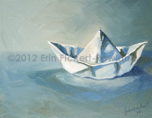 |
| “Apilco No. 6” oil on canvas panel, by Erin Fickert-Rowland, 2012 |
My wonderful little model looks like a paper sailboat hat, doesn’t it? It’s actually a porcelain salt dish on a draped cream cloth. In “Apilco No. 6”, I have used only Ultramarine Blue, Cobalt Blue, Yellow Ochre, Black and White. I’ve enlarged the subject matter, elevated the horizon, and focused on the lonely surface this little boat floats on. It’s such a simple composition, but I am pleased with how it turned out. It doesn’t really invoke emotions of woe and despair, though- I think it suggests more isolation and serenity.
For the second piece to be cheery, I knew I needed to change it up a bit:
“Apilco No. 7”
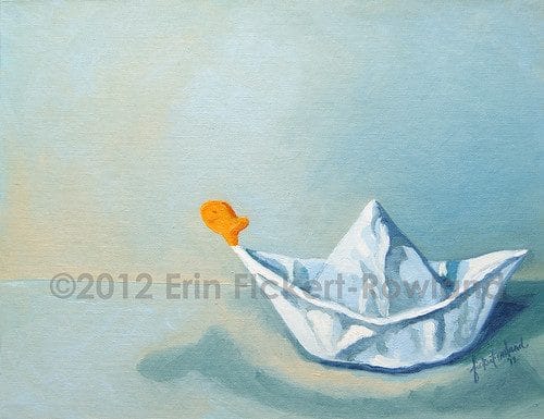 |
| “Apilco No. 7” oil on canvas panel, by Erin Fickert-Rowland, 2012
My kids love Goldfish…, so I snagged an abandoned bag that had not been eaten during school snack and decided it would be perfect to springboard off the end of my boat! I bent the rule a bit by adding the complimentary orange here, but I used the same Cadmium Yellow and Cadmium Red to mix in with my Ultramarine Blue for a harmonious palette. I also added Gray and White. For this composition, I lowered the horizon, and made the subject smaller, therefore giving our little fishy friend more room to leap into the great beyond. One of the things that I just love about painting is that you really aren’t in control of it all (well, if you are, then that’s just not fun for me). Do you notice the shadow that developed on the “water”? That makes it look like the fish is falling into the water, but what about the light source that developed at the top left of the image? It kind of makes him look like he’s being “called home”. Is he going up or down?! That’s where this becomes art! You can start to create a narrative based on the imagery provided. I really want to work on this aspect of my painting. I am in the process of developing a new series that focuses on this. Right now it’s just outlines of subject matter and ideas, a few loose sketches, and the assembling of my cast of characters. First, I need to finish this series, and that will involve more experimenting with what happens to white when it rolls up into a color-addict’s painting…. |